Page 2 of 3
Columbus, Ohio
With fingernails that shine like justice and a voice that is dark like tinted glass
Before 1989, if you asked any self respecting architectural student about Peter Eisenman he (or she) would talk about some experimental houses with Roman Numerals or a lot of writing. After 1989 he (or she) would forget all about House VI and all that incessant writing and only talk about the Wexner Center, the architectural pride of Columbus (Ohio). Fourteen years later the Wexner Center is already being faithfully renovated, is only partially open and is still an icon of everything Peter Eisenman always thought he was.
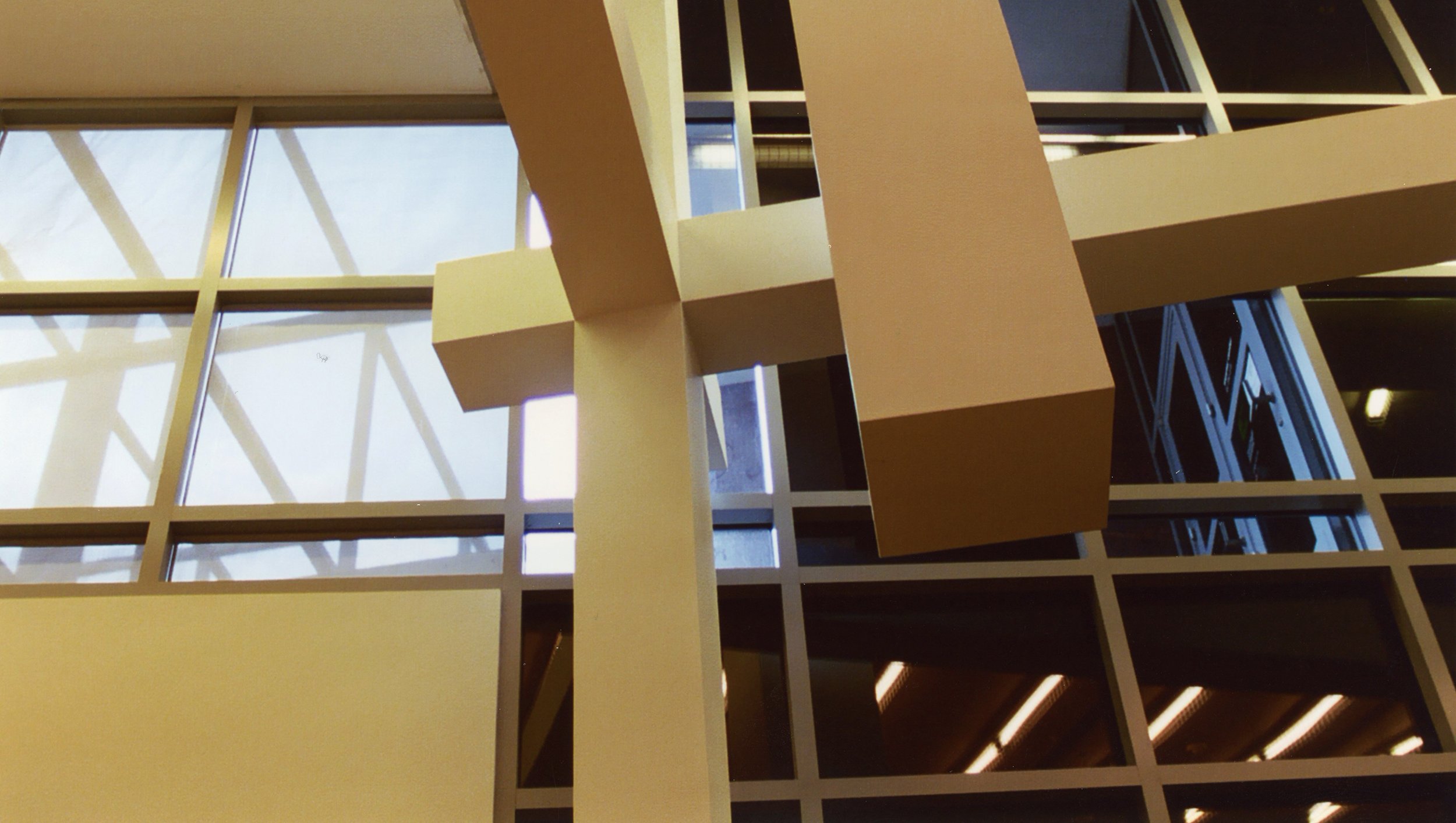
A rare interior photograph in the only area open on an August Saturday during renovations.
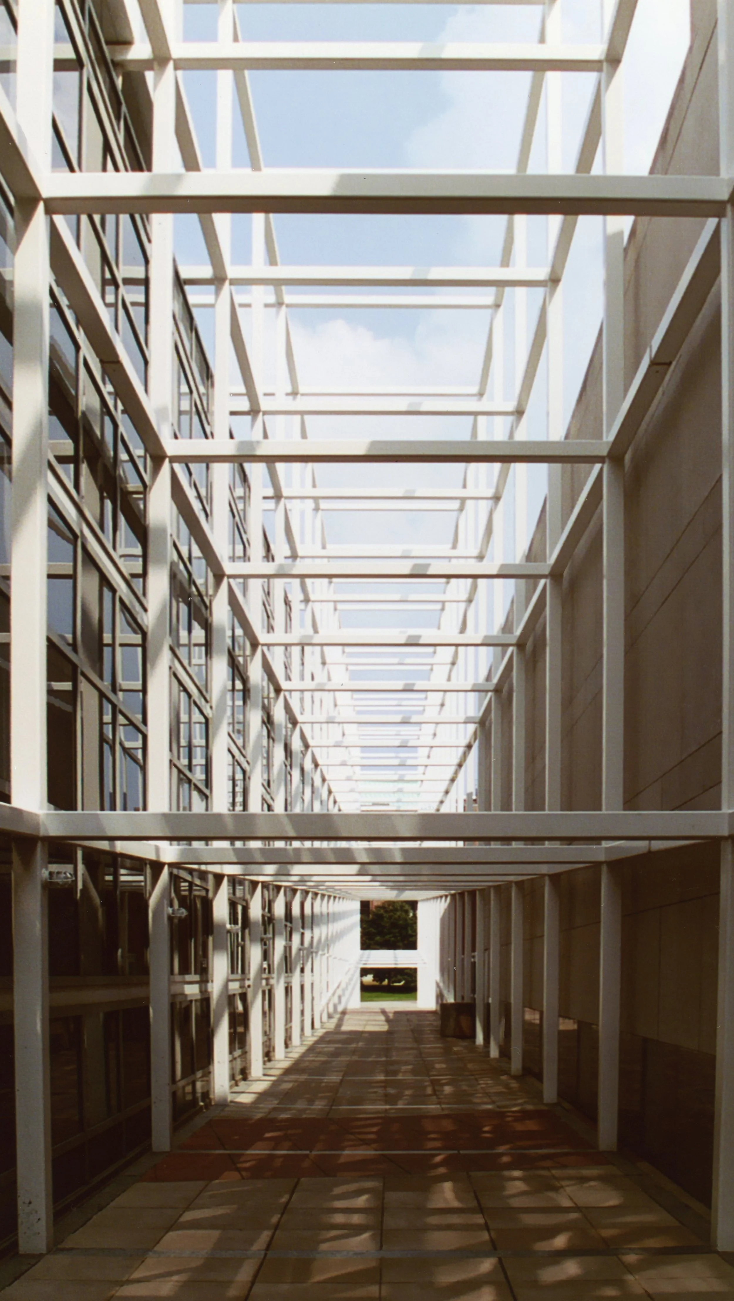
The famous all grid exterior passageway on that hot August day, as the campus slowly filled with confused freshman not only wondering what was up with the Wexner Center but also wondering for possibly the first time what the hell a Buckeye is anyway.
The only (good) reason to visit Cincinnati, at least downtown. The Contemporary Art Center (CAC) is Iraqi born British architect Zaha Hadid's first US building and a damn good one at that, although still a bit of a disappointment. Sure it has a great exterior (better than the photographs suggest) and a fun lobby, but after that it begins to become a victim of its own hype. Taped to the glass walls of the vestibule are congratulatory articles from the New York Times, one of them heralding the CAC as the greatest American building completed since the end of the cold war. No building this good can ever compete with such giddy expectations- still it has its moments (including this view in the so called fun lobby), none of which appear to photograph very well.
One of my favorite buildings (and my hands down favorite building in New York) is the Whitney Museum of American Art, a building that compares well to the CAC. Both are located in a city, both have an unusual exterior that projects out into the solid streetscape and both have stairs that are interesting enough to tie the galleries together. After that my comparison begins to lose weight, especially when it comes to the collections- trust me, no one is traveling all the way to Cincinnati to see the art.
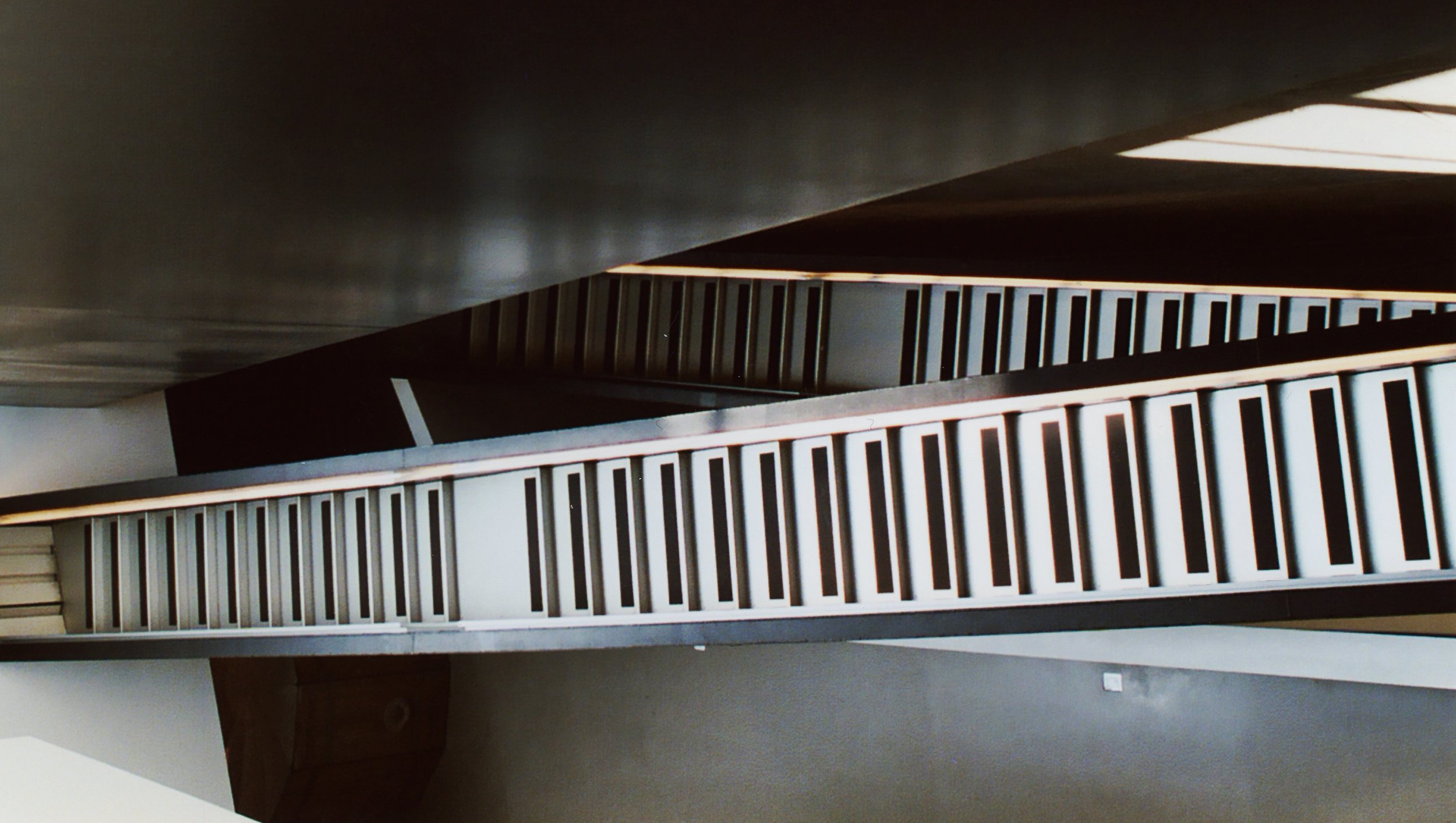
This is a view from halfway up the stairs, looking up the stairwell straight (or as straight as it gets) to the top.
A disco self portrait- but then again, which self portraits aren't really disco self portraits anyway? For those still looking, I'm the pixilated guy in that first shiny disco ball. The galleries themselves are interesting but not great, a lot of dead ends, a lot of unnecessary elevation changes, a lot of things that fight the (generally) weak collection.
From Sixth Street, the building sure looks interesting enough (for comparison purposes, the other big name downtown building- the ten year old Arnoff Arts Center by Cesar Pelli- is across the street on the right side of the picture). It takes full advantage of its corner lot to sweep forward, giant pieces of stone and concrete feel either frozen in a moment of time or constantly moving, take your pick.


