Page 4 of 6
New York, New York
At least there's pretty lights, although there's little variation
Hey wait, what’s that? Is that the Olympic torch? How can that be? Aren’t the Olympics in Athens this year?
The 2004 Olympic torch relay went around the world before returning home to Greece, and even though I did not seek it out, I just happened to be in New York as it passed me on by. Citius, Altius, Fortius!
On display at Grand Central Terminal’s Vanderbilt Hall are the models for the 2012 NYC Olympic Village plans, on a site in Long Island City across from Roosevelt Island and the United Nations.
Ignoring the wacky East River beach idea, I like the MVRDV slanting towers (the first picture). I just think that they're an interesting reaction, not as overdone as the rest of them. I am not sure what to think about the others. The models are so abstract that its not really a fair judge of what this is going to actually look like, when (or if) it is actually built.
We’re on a bit of an architectural model tour of New York, and continuing on with the original Daniel Libeskind Freedom Tower plan, on display at the Center for Architecture on LaGuardia Place. Potentially this is kind of interesting, although you just know that the model is going to look nothing at all like the actual building.
More models, including this one on display at the Winter Garden at Battery Park City, in that glass display area behind the bathrooms behind the stairs. I think this is probably the most realistic as to what the memorial is going to actually look like, plus if you look inside you can see the crazy fun Santiago Calatrava WTC PATH Station building peeking between the towers. Of everything under construction down there, the WTC PATH Station is the one I’m most surprised about and also the one that I’m looking the most forward to actually seeing one day.
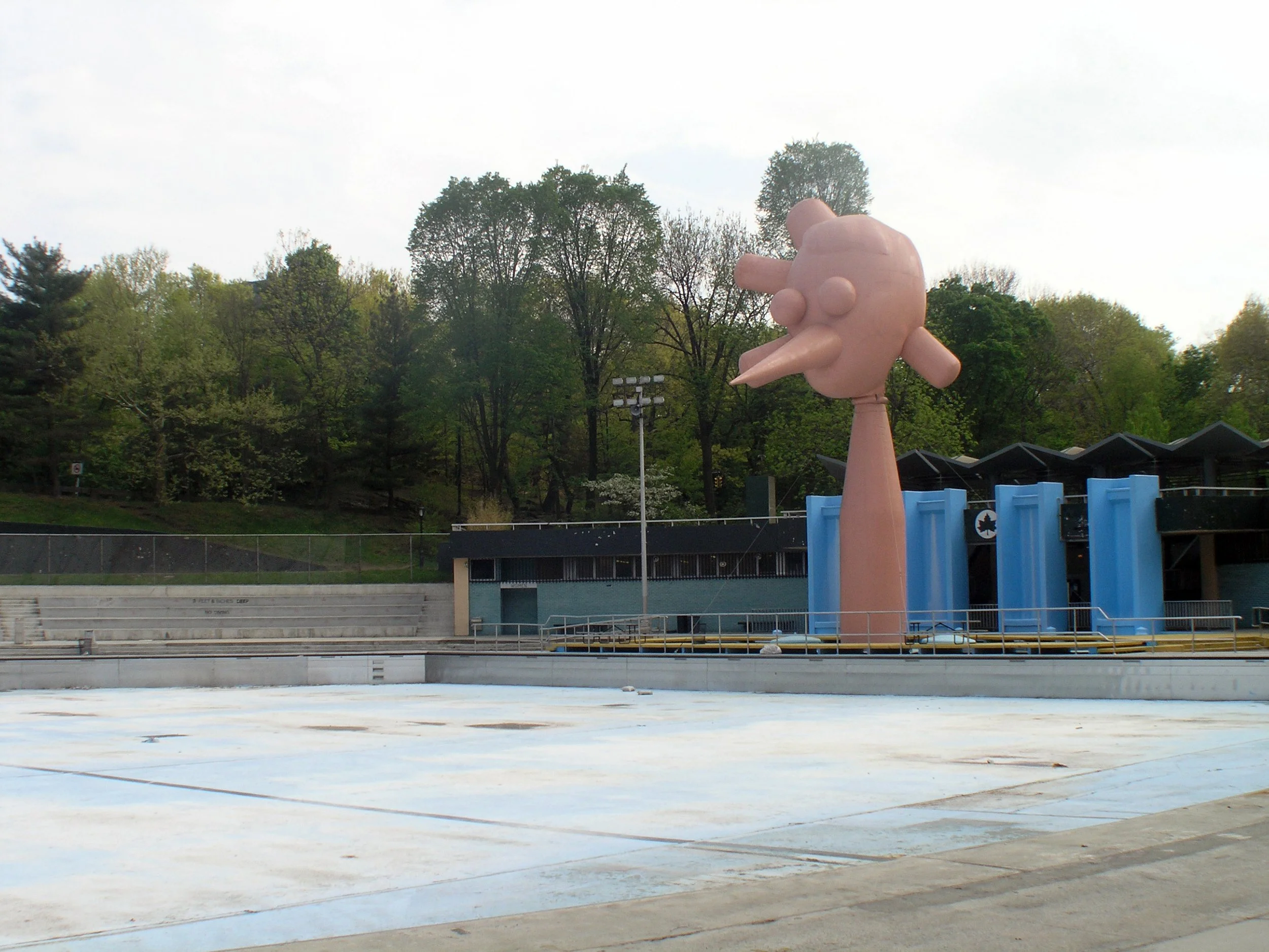
This is a Whitney Biennial year, and in addition to everything inside the museum, there are a bunch of installations in Central Park, including a giant blow up head called Daddies Bighead by Paul McCarthy and a bunch of shiny balls blocking the toy sailboat pond called Narcissus Garden by Yayoi Kusama.
MoMA was still closed most of the year, and I stopped by a few times for some construction photos and took this of the neighboring American Folk Art Museum. Designed by Tod Williams and Billie Tsien, I absolutely love the building and hate its collection. Ok, maybe hate is too strong of a word here, but it feels like nothing but ok (but certainly not great) weathervanes and pie plates inside.
Next door is complete opposite land at the brand new Museum of Modern Art building, where I absolutely love the art collection but hate the building. Ok, maybe hate is too strong of a word here, but I do not understand all the positive reviews for a confusing building with an escalator stack like a department store and a gallery layout that is like a maze except that you don’t win anything if you solve it. The old museum was not great, and this new one feels gigantic, and maybe over time I’ll grow to love it. But at it’s opening it feels like such an incredible lost opportunity.
And after all those Olympic torches, architectural models, outdoor installations and museum buildings, we’ll finish up this page of the slideshow up at Dia Beacon, where Richard Serra’s Union of the Torus and the Sphere bathes in natural light, just like everything else there.

