Page 2 of 4
San Francisco, California
We've been running in circles just to find things in the middle
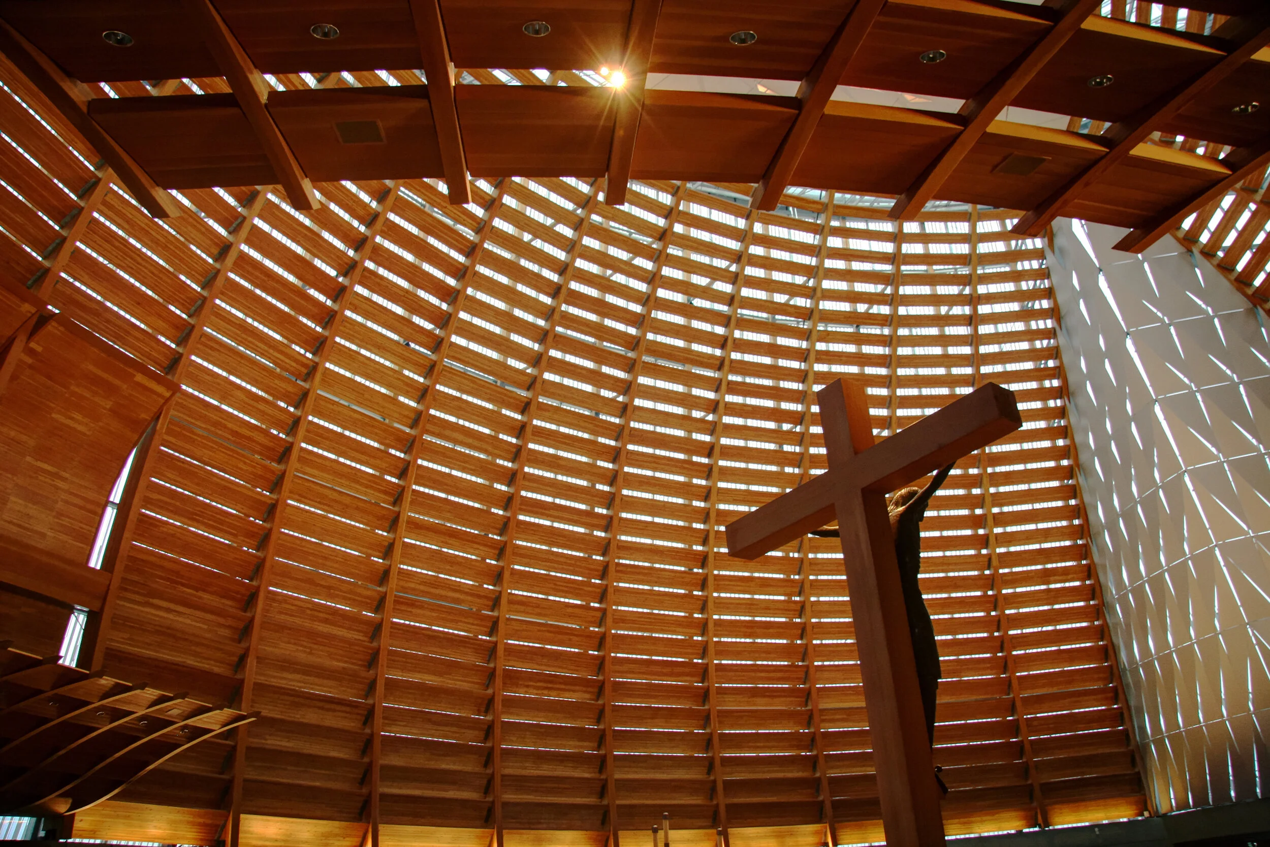
As part of a totally separate AIA tour (all about downtown modernism), I enjoyed a brief stopover at SOM's San Francisco Office, an outpost of SOM's global operation that has pushed out some pretty good projects lately. Chief among those (in my opinion at least) is Craig Hartman's Cathedral of Christ the Light in nearby Oakland. While only moderately impressive on the outside, its inside makes up for any perceived disappointments. An interior system of wood louvers and solid panels in front of fritted glass work together to create a space easily better than the sum of its parts. This well crafted model at SOM's lobby (and model heavy office) starts to explain the construction so you can start to imagine the building- or you can just look at the pictures of the building below. Your choice.
Here we go. This first view looks straight up from the main entrance right to the roof and the heart of the space.
And much like the two buildings from the last page, I managed to sneak a quick trip out to Oakland on my own despite what could best be described as an over booked, wall to wall convention schedule (I know, I know, I'll try and give myself more free time next time). After my solo Oakland trip I spoke with another architect who had taken an AIA guided cathedral tour who told me that he was surprised when the tour guide told him that the design of the building was based on fish imagery (a big early Christian symbol). I'm not sure what exactly that other architect missed initially to be surprised by such a revelation. Maybe he thought those things that looked like giant fish scales really looked like something else. Or maybe he thought that the blatant, near impossible to miss fish shape of the building's interior looked like something other than a great big fish. I guess we'll never know.
From back behind the altar, layers of wood hide and reveal layers of light, something quite fitting in a cathedral with the word light in it.
The cathedral is part of a much larger complex featuring many of the things you would expect to find in a modern religious complex, including the well done mausoleum downstairs, the quiet little chapel directly behind the altar and all of the community rooms and functions you could expect or want.
The classic nave view, the one that grips you right from the start, and the one with the great big glowing Jesus who looks not quite right. It's kind of looks like he's sitting down, wearing a great big hat and being sworn in for jury duty, not that there's anything wrong with that.
Frank Lloyd Wright's very last commission was the sprawling space age Marin County Civic Center north of San Francisco. Completed after his death by the very studio he had founded, it carries through many of the themes and ideas of his life and work with only the occasional glaring decision that seems a little too much unlike Wright and a lot more like a group compromise from a lot of people who were trying to think just like Wright.
As part of the AIA Convention I took a rather comprehensive tour of the building, earning continuing education credits and learning stories about the design and history of the building. This brief three slide tour starts pretty much where the tour started, inside one of the circular courtrooms and one of the few that was not arraigning or convicting local criminals that day. The advantage of the circular design was explained as an advantage since everyone in the courtroom from the judge, the jury, the defendant and the lawyer all had a front row seat of each other, that all were somehow equal in the eyes of the room. An idea that never really caught on in other American courtrooms where most judges prefer to let everyone in their courtroom know that they're a lot more equal than everyone else.
The building was designed near the end of Wright's career, at a time when he was less about the prairie style and much more about the automobile and includes (and features) an entrance from cars to a long, linear building with this central open courtyard. Originally designed to be open to the weather, things changed quickly when everyone realized that even though it was in California, it wasn't in the sunny dry part but instead the cold and wet one.
The UFO has landed.
Wright surveyed the site and decided that the building should act as a bridge connecting two hilltops (which it does). He also decided that the roof should be gold to be in context with the golden hills of California, although that idea was scrapped after Wright's death since no one could find a decent gold colored roof tile to achieve the intended effect. In the end the building's pointy tower (which hides a smokestack) was the only part that ended up getting the true golden treatment. Meanwhile the building seems to hover over the site like something from the future, part of the reason that science fiction films like "Gattaca" and George Lucas' "THX 1138" used the building as a location. Not too bad for a building pushing 50 years old to be still considered so futuristic.
One last quick story. Wright knew he was designing in an active seismic zone (I mean who wouldn't know that) and he designed the building to move with the land and hills should the nearby San Andreas Fault finally fulfill its long dormant promise of another earthquake. Not that long ago, the state ran careful and comprehensive computer simulations to test Wright's theory only to find out that it was actually true. Unfortunately however Wright only thought about the San Andreas Fault and not the Hayward Fault, one which could easily destroy the building unless action was taken. Our guides showed us example after example of late added cross bracing designed to (literally) hold the building together in the event that the worst ever actually happens, a comforting thought as I walked through a historic building on such a beautiful (and potentially violent) piece of land.

