Page 2 of 2
Miami, Florida
Afraid of the house stay the night with the sinners, afraid of the house stay the night with the sinners, afraid of the house cause they're desperate to entertain
Finally some architecture. This pagel features images from tours from the AIA Convention, all of special interest to design professionals (you know who you are) but hopefully not too boring for the balance of everyone else.
To start things off we'll head right to Miami Shores (on the mainland and across the causeway from Miami Beach) to visit Arquitectonica's very first building of note, the Pink House. The house (designed for the parents of one of the partners) is made up of five vertical planes, each one painted a different shade of pink and each vertical plane getting lighter as you head closer and closer to the water. The house and its spaces reside between those vertical planes, for example an outside space exists between the first two planes and in it sits the swimming pool- visible in this photo through the blue circular porthole before you head up the stairs. A surprisingly nice building and one that normally is just never open to the public, one of the reasons that the AIA Convention tours are often just so damn good.
As for Arquitectonica, they are all over Miami and for good reason- most of their buildings feel just right for a tropical city. On a separate tour I was able to see more of their local work including a parking garage covered over in live plants, another parking garage hidden by a bamboo type metal screen, a condo building with a big hole in it (the one from the Miami Vice credits from years and years ago) and a surprisingly sophisticated courthouse downtown.
Too much is never enough, unless of course you start looking at Rene Gonzales' spec house still under construction at the very exclusive security protected island of Indian Creek, just off Miami Beach. The single family house is huge, perhaps painfully so. It features some 30,000 square feet of air conditioned interior space and 20,000 more square feet of exterior courtyards and pools. A partial list of amenities include three interior kitchens (a showplace kitchen, a breakfast nook private kitchen and a staff only back kitchen), a private spa with massage tables, a media room, a courtyard with vertically planted green walls, a separate guest wing and a downright huge walk in closet with a panic room (which was described as just like the one in the Jodie Foster movie, except that things wouldn't go wrong like in the movie). But the best thing is pictured below, or, more accurately, partially pictured below. There are a series of interconnected pools throughout the courtyard, all fed by a sheet of water (dead center in the photo) which drops from the Jacuzzi on the balcony above. At night the sheet of water doubles as a video projection screen for the outdoor entertainment area. All this could be yours if you have the cash- the house is being prepped to go on the market with an asking price in the neighborhood of $50 Million, a pretty nice neighborhood if you can afford it I guess.
Before I went to Miami Beach I imagined all the good buildings were either new ones by Arquitectonica or mid century classic ones by Morris Lapidus and, just as I imagined, I wasn't all that far off. This is a detail in the kitchen of the Eiber House, a rare residential project by Morris Lapidus and one that could probably fit completely inside the walk in closet of the spec house from the last picture. The house may have been small (or, more accurately, properly sized) but it wasn't without its charms and some real Morris Lapidus touches, like the concrete bubble screen just outside the window, used to at least partially protect the private kitchen from the public street.
There is a six or seven block stretch of Collins Avenue where MiMo (Miami Modernism) comes alive and at least half of the buildings (if not more) were designed by a very prolific Morris Lapidus. On an AIA walking tour with an alarmingly high rate of attrition (it was after all really, really hot out) we saw building after building but ended up in the best and most famous, the landmark Fontainebleau Hotel. I had initially planned on staying here just to really start to get to know it, but abandoned such glamorous hopes for the convenience of being within walking distance of the convention center.
Meanwhile back at the recently restored Fontainebleau (named after a forest just outside of Paris) it's still 1954, especially if you don't count all that dance music and all those flat screen tvs playing the World Cup. The lobby features the still famous staircase to nowhere- Lapidus designed a womens cloak room with a very special circulation pattern. Women would enter the ground floor lobby, ride a special elevator up one level to this special women's cloak room, and then slowly descend a spectacular staircase, making their grand entrance to the lobby, with their left hand (wedding ring side) sliding down the handrail. You just have to love Lapidus.
The hotel may have had no one (with the exception of our AIA group) on the stairs that day but it doesn't mean that people still don't come to the Fontainebleau to show off. Outside the resort were a line up of bottom feeder paparazzi (or is that paparazzo?) who were lined up to take pictures of a Kardashian at the pool. I'm not sure which Kardashian it was (or exactly how many Kardashians there even are to choose from), but it did seem appropriate at the Fontainebleau and something that would have made Lapidus proud.
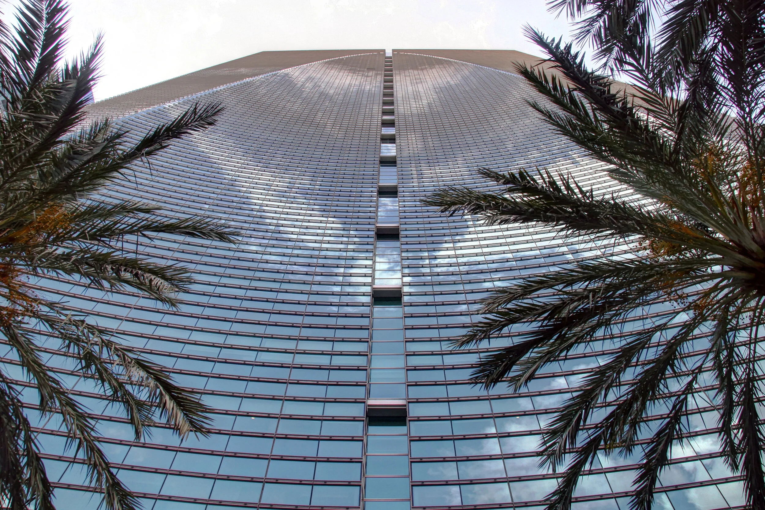
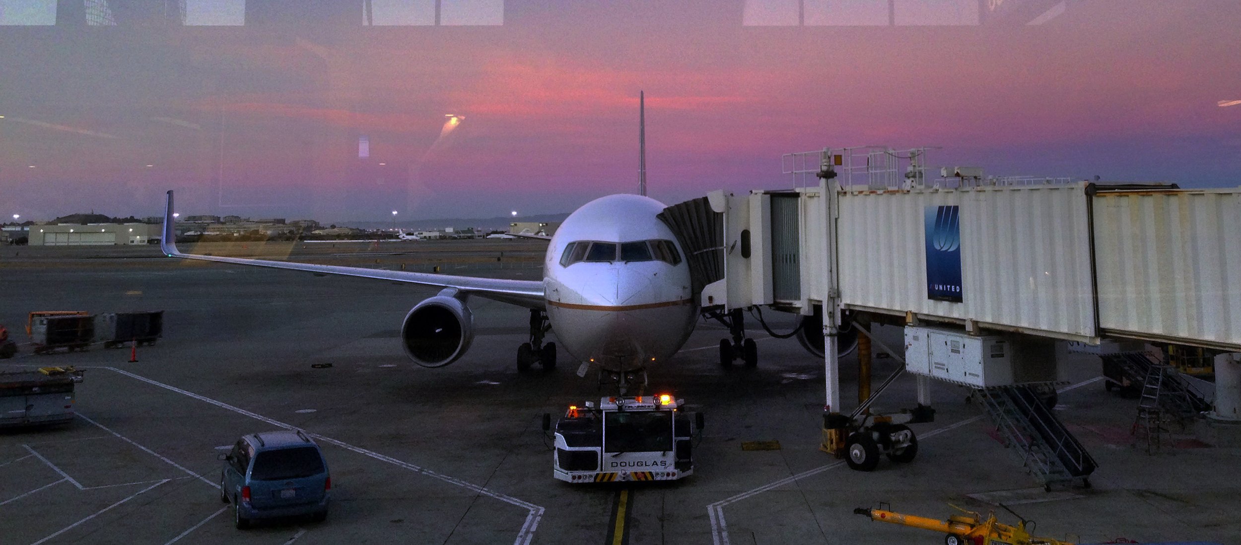
I took eight tours in four days, amassing 21 credit hours and, more importantly, getting to see and learn about all sorts of buildings and places that would otherwise be closed to the public. I enjoyed a backstage and runway tour of the American Airlines Terminal at Miami International Airport, got into five private houses, and enjoyed an almost private tour of Kohn Pederson Fox's downtown Espirito Santo Plaza by its project architect. The tower is mixed use (office, hotel and residential) and has a wonderful concave and angled Brickell Avenue facade. There are all sorts of great little spaces and tricks, including a spectacular see through water court, a really fun pool on top of the parking garage and a hotel sky lobby high above the offices with a great view of the city and bay. All of these great spaces did lead to some really odd planning however. For example if you were staying at the hotel (a Conrad) and wanted to go to the pool, it would require first taking an elevator from your room up to the sky lobby, then an express elevator to the ground floor, then walking outside across an active driveway and under the water court and then up another elevator and then up an out of the way ramp or back handed stair. I guess circulation wasn't KPF's first priority.
The most controversial new building in Miami Beach is a parking deck. 1111 Lincoln Road is a totally overdesigned and totally unnecessarily large parking deck designed by Swiss architects Herzog & de Meuron. A really interesting building in a lot of ways and one that feels like it actually belongs in Miami- it is a parking funhouse of ramps, compression, expansion, retail spaces in the middle of cars and a winding sliding stair that makes finding your parked car fun again.


