Page 2 of 3
London, England
The future's under fire, the past is gaining ground
One reason that September 2016 seemed like a great time to go to London was this, the brand new Switch House addition to the Tate Modern, one of the great contemporary art museums of the world. A great addition and another great reason to visit London and the Tate Modern all over again.
This view shows the original museum (inside a renovated power station), the brick screened twisting Switch House sneakily rising above and a few nearby all glass residential towers. The Switch House comes with an observation level that pretty much looks directly into those all glass residential towers, and features a small sign asking you to respect the privacy of people living in all glass boxes right next to an observation area filled with camera wielding tourists. And if the highly recommended movie "High-Rise" is even remotely accurate, there will soon be a lot to look at as the lower classes on the lower floors eventually revolt and riot against the upper classes on the upper floors as Tom Hiddleston loses his mind and eats a dog. And you'll be able to see it all from the giant open balcony at the Tate right across the street.
The museum addition at the Switch House is a world upon its own, with just two connections to the original building- one at the floor of the turbine hall and another on a bridge at the top of the hall. To get between those two connections you have the choice of a crowded elevator or a really nice stair that changes just enough floor to floor to keep things interesting. Large exterior windows are all over the place, although a lot of them are hidden by a checkered open hanging brick screen. If Louis Kahn's bricks talked to him and told him they wanted to be an arch (chances are they didn't unless they were magic talking bricks or Kahn was just straight off insane), then these bricks would have told Kahn to go screw himself because they want to fly.
By the time you get to the very top of the Switch House, you've already seen all of the damn good art, passed by a cafe and shops and offices and a members club (seriously as a Whitney and MoMA member, why can't US museums have member amenities like the Tate Modern), and you're doing everything you can not to stare directly into the adjacent High-Rise as Tom Hiddleston snacks on a Siberian Husky. Meanwhile on the other side of the building is sweeping view after sweeping view of everything that London is right now, a mix of historic buildings, iconic landmarks and new towers built with varying degrees of success.
So after visiting the Tate Modern and the Switch House and all that world class art, we find ourselves staring at and through a temporary summer pavilion that by now has already been torn down. I never claimed that this slideshow possessed any overarching logic or narrative, despite my vain attempts to mask such obvious inequities with big words like "inequities."
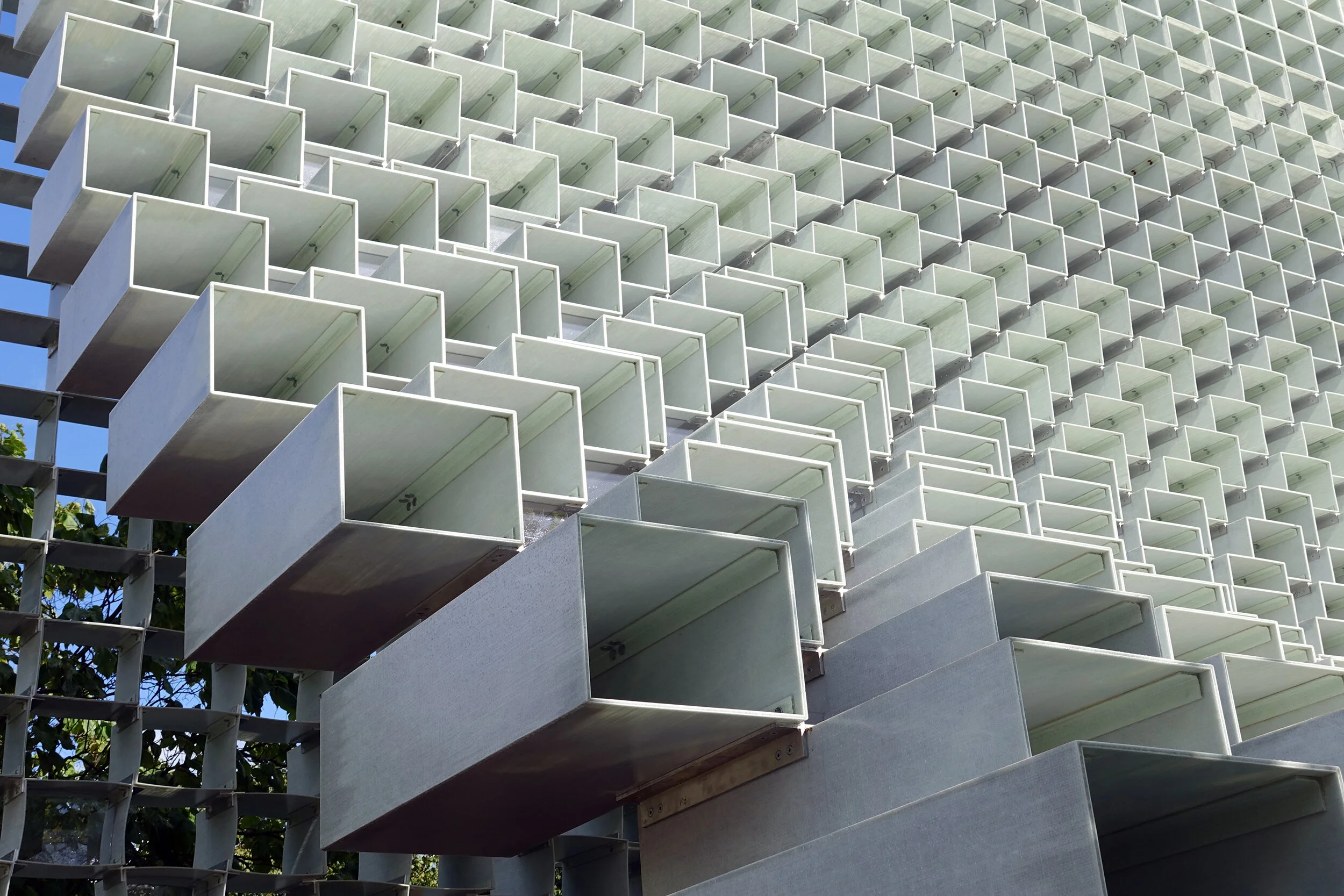
I have been to London before and hope to be in London again, over time it has become familiar enough to me that I think I don't need a map or much planning to explore the city (I'm usually wrong about that). I do not really need a reason to go to there anymore, but this time I actually had two. The second reason that September 2016 seemed like a great time to go to London was this, the summer pavilion at the Serpentine Gallery, designed in 2016 by hard to avoid architect Bjarke Ingels, who is possibly on a plan to one day have buildings in every slideshow and/or flickr album I will ever post. As expected, he did a damn good job at the Serpentine, creating a wall of hollow boxes that push and pull and stretch in ways that are formally interesting yet somehow still unexpected in person.
There might be new things to see all over London, but we'll end with something familiar. This is another constructed panorama, this time at the Great Court of the British Museum, where everyone spent some time hiding from the rain underneath Lord Norman Foster's still wondrous donut glass ceiling.

